My standard response to a claim that a design is timeless, is that “timeless” design doesn’t exist.
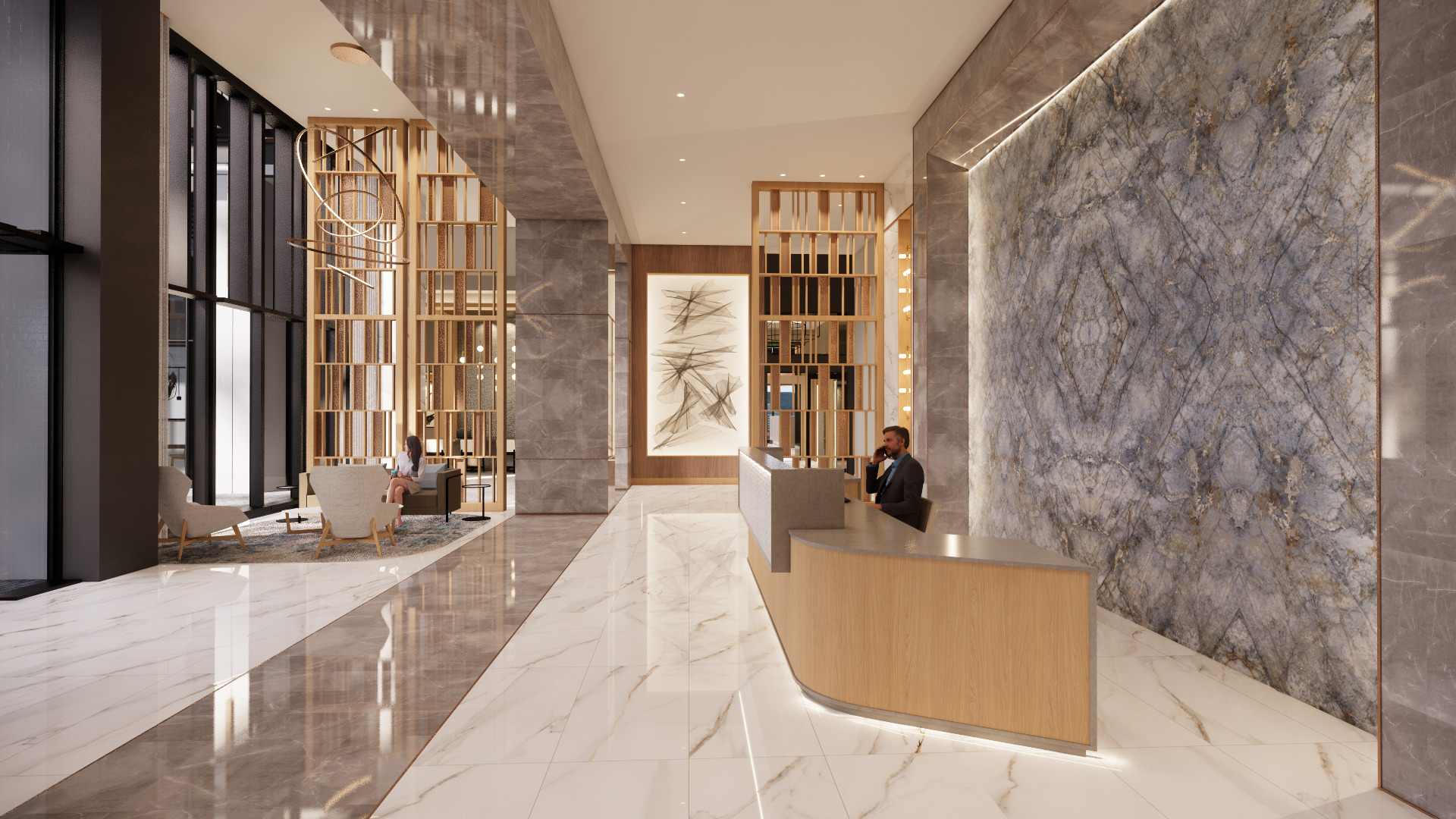
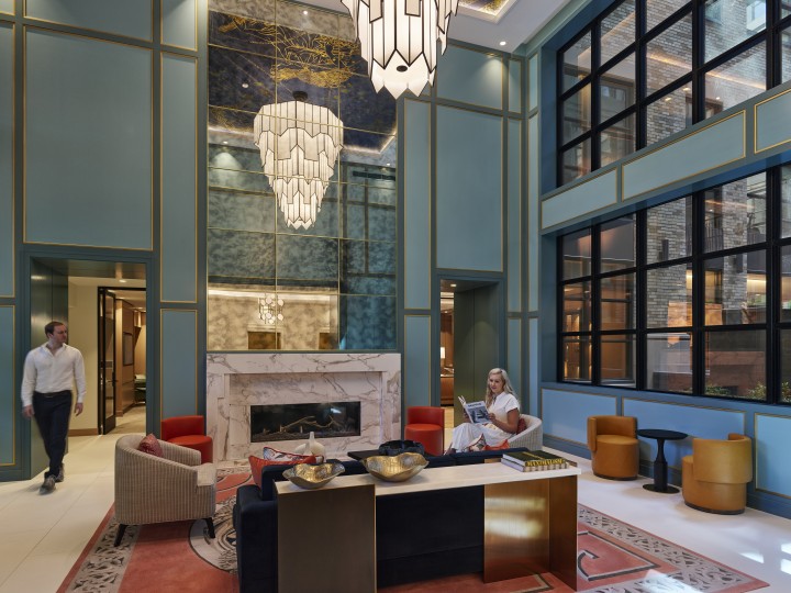
Everything is “of its time”, and you either like it or you don’t. As I have been musing on this lately, I also have been reflecting on why timelessness is often associated with modernism, minimalism, neutral colors and simplicity. Modernism in architecture with its “less is more” mantra, is unpretentious luxury and elegance. It followed decorative Art Nouveau and Art Deco styles which celebrated detailed, lush, and adorned spaces. Rather than multilayered environments, modernism highlights quality materials and craftsmanship.
In a similar vein, fast forward to the early 2000’s and the rise of neutrals presumably came from a psychological desire of tranquility, stability, calmness, in a visually saturated world. Perhaps this was a reaction to the vibrant, high contrast, bold colors of the 1970’s & 1980’s. Or perhaps as a hesitancy to make bold statements in favor of more subtle moves. Neutrals are considered “safe,” the thinking is that they will transcend fleeting trends and act as a versatile canvas for small injections of color. Neutrals are practical and easily maintained, and thus a maintenance favorite.
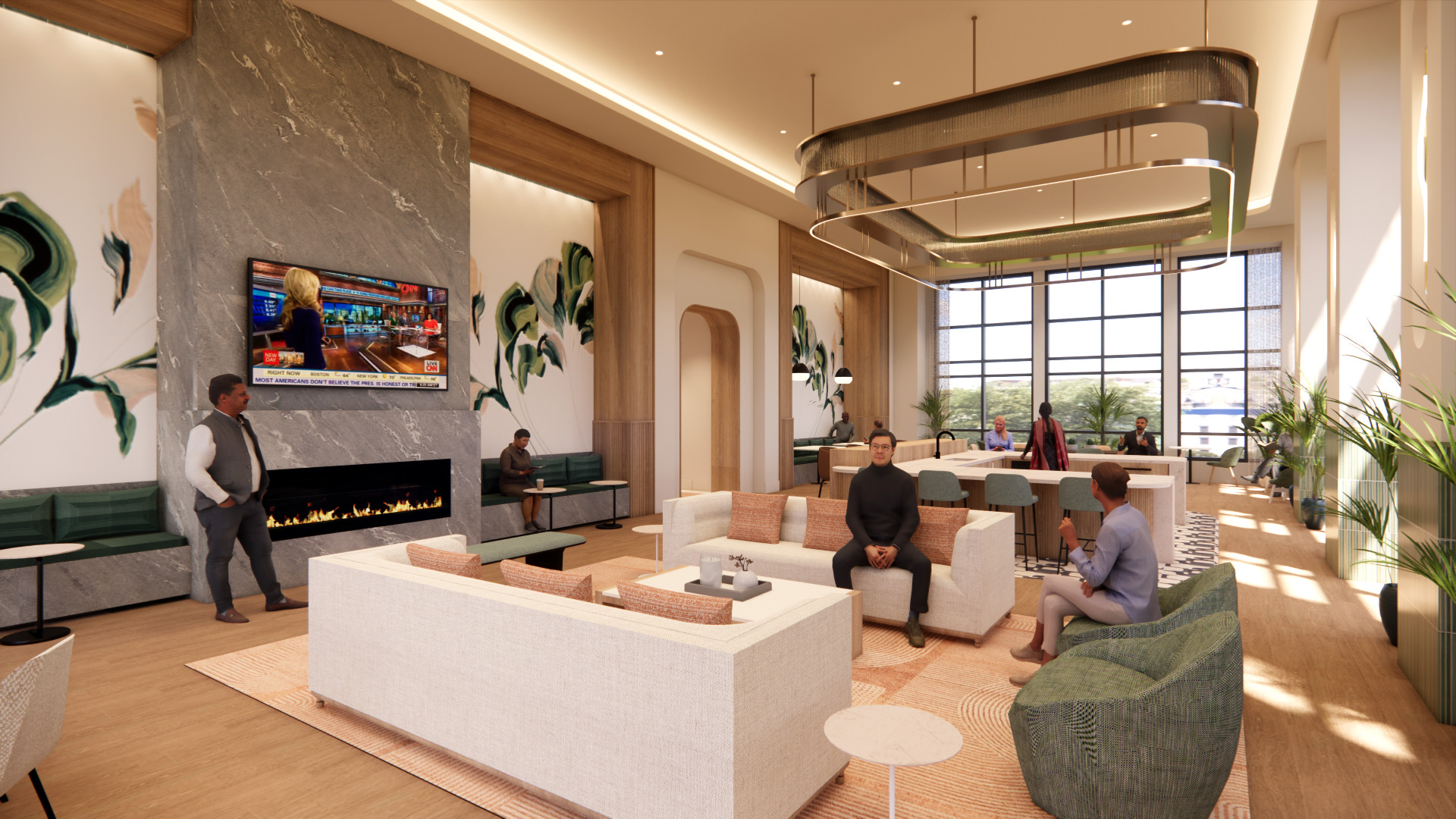
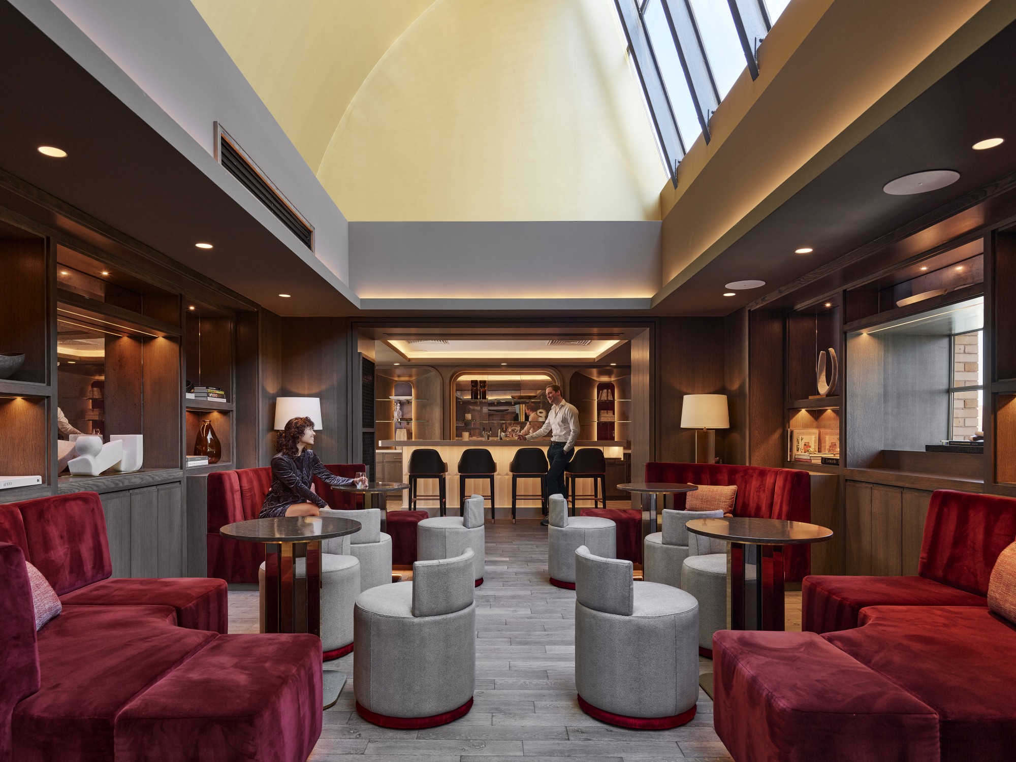
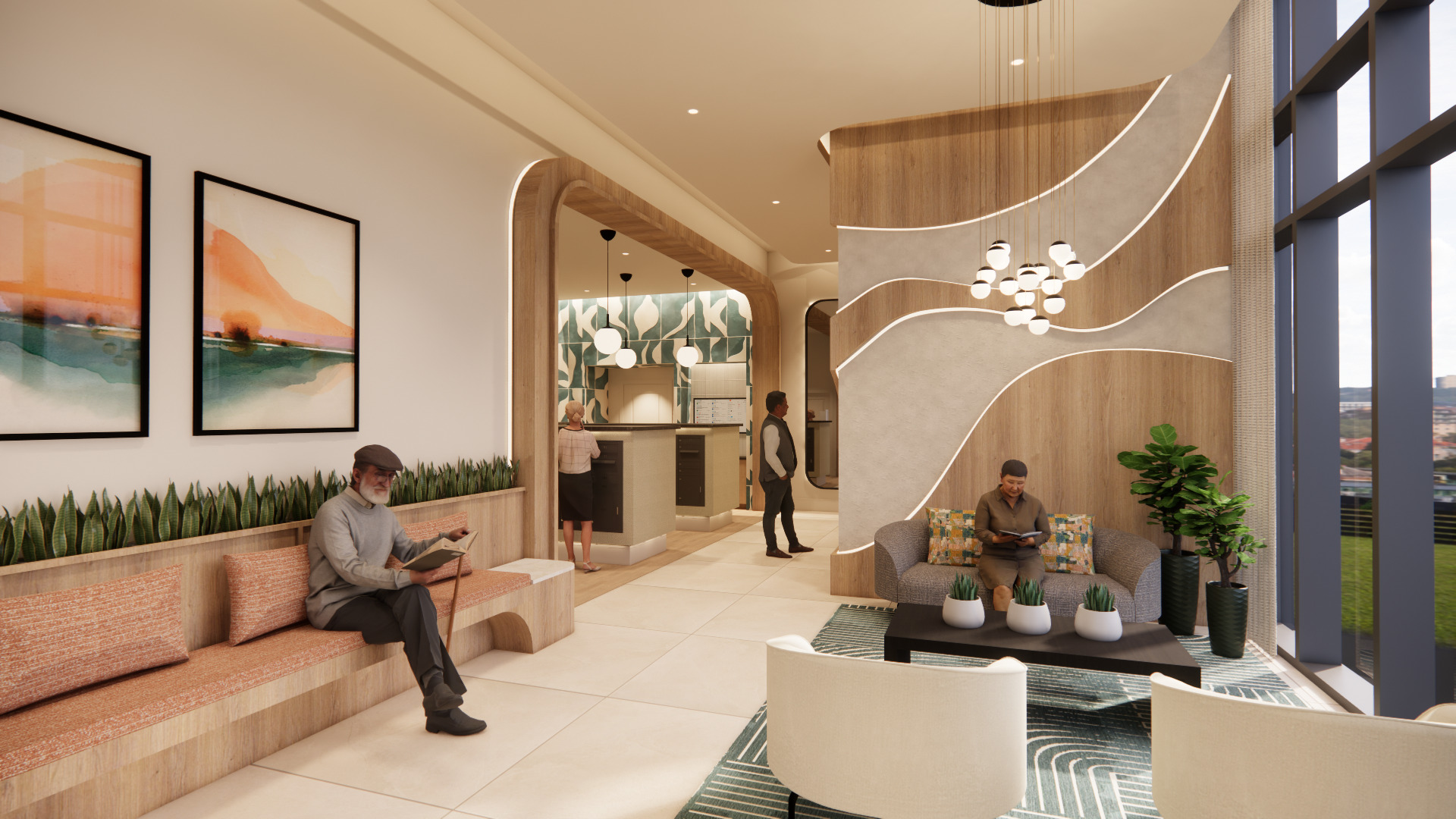
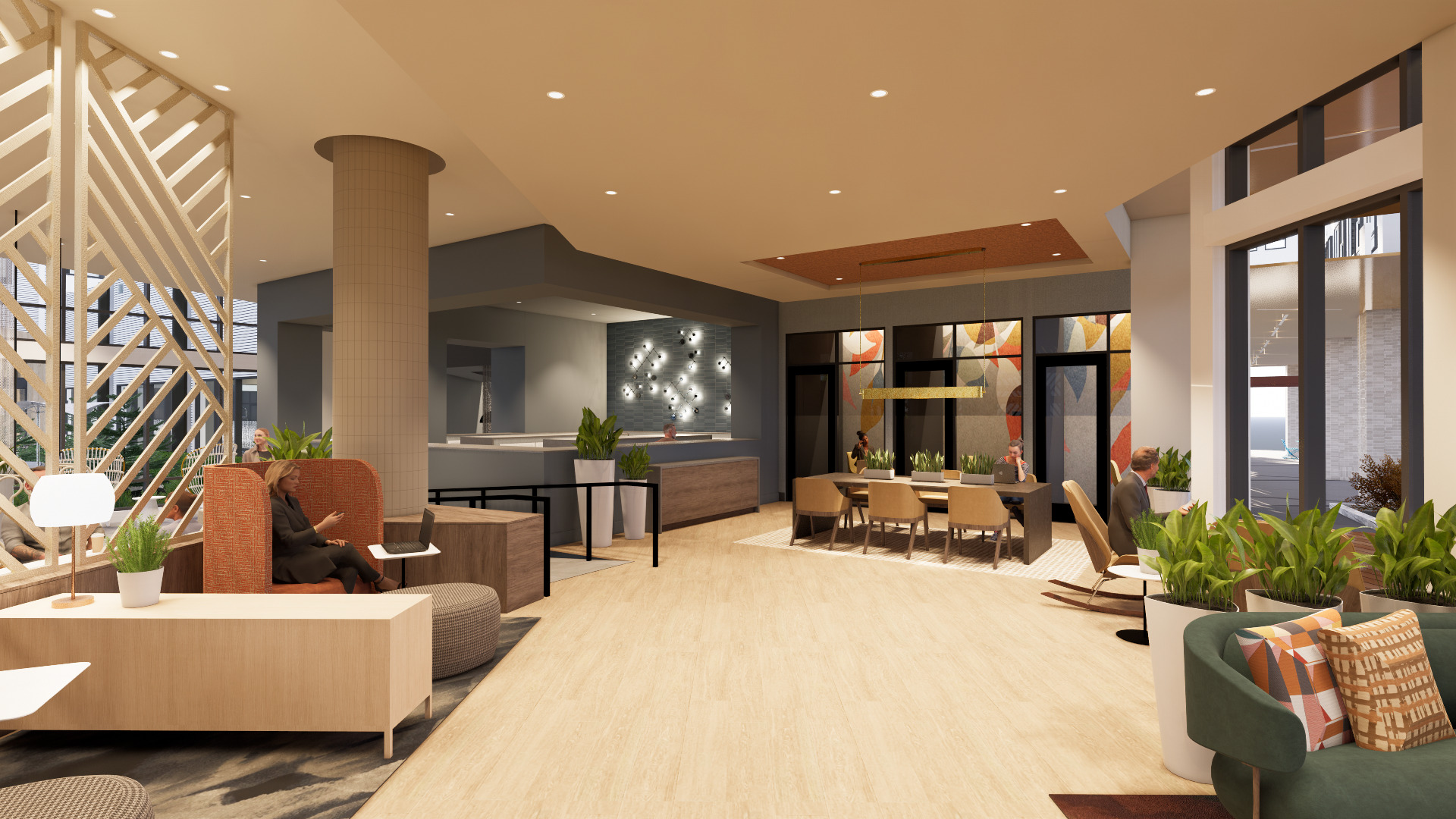
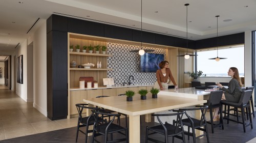
My recent musing on color have been further confused by Pantone’s choice for 2026 Color of the year, Cloud Dancer, a shade of white. Neutrals have reigned for some time now, but within the last year I have seen more desire for color, which runs counter to this selection. We have seen more earth tones, and rich hues. Injections of energetic color, and inspiration from nature. Neutrals will always be a staple, but we have seen a focus on warmer, richer palettes and more confident, bold, personalized color and pattern choices in the commercial design world.
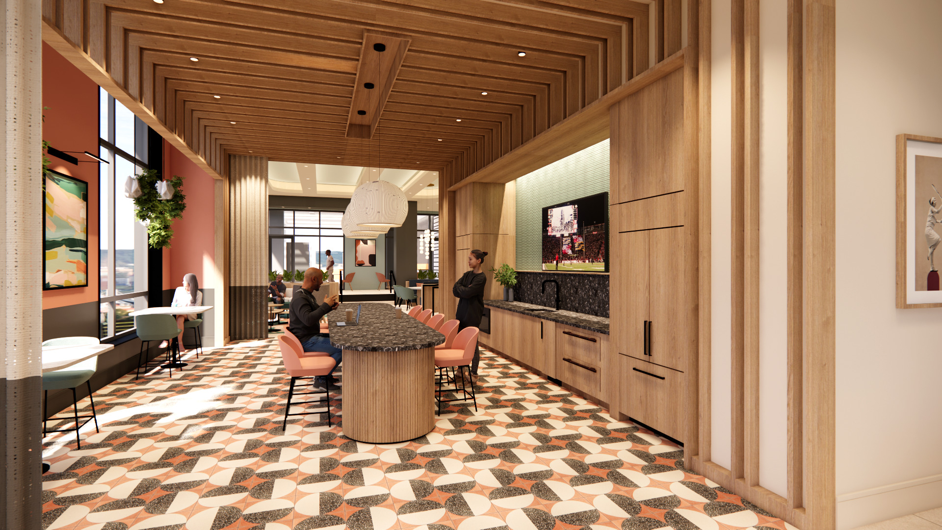
Similar to the rise of modernism from the ornate roots of Art Nouveau, I have been asking myself what is driving this desire for more color? Is this a pendulum swing of optimism? Is this a way to create optimism in otherwise uncertain times? Is this a result of our time spent cuddled up at home during covid, wanting more personalized and rich environments? Are we rejecting the neutral office environments in favor of spaces with personality? Are people craving spaces that feel more personal, inviting and expressive?
Digging into it, Pantone knew exactly what they were doing when they selected Cloud Dancer as the 2026 color of the year. Pantone is making a statement with “a lofty white that serves as a symbol of calming influence in a society rediscovering the value of quiet reflection.” However, now is as good a time as ever to lean into the emotive and expressive potential of color to define the spaces we want to inhabit, gather in and create community.
Just my five cents.